
Seller lead postcard concept
Short headline, direct CTA, and a stronger visual hierarchy so the card still reads in one glance.
- Seller-focused offer framing
- Simple phone-first CTA
- Built for targeted bulk county mail
Sample postcard gallery
Use this page to show what the offer looks like in practice: clear message hierarchy, land-specific targeting, and layouts that still read fast in the mailbox.
These are design concepts showing card styles and campaign structures — not photographs of mailed customer campaigns or claims of results.
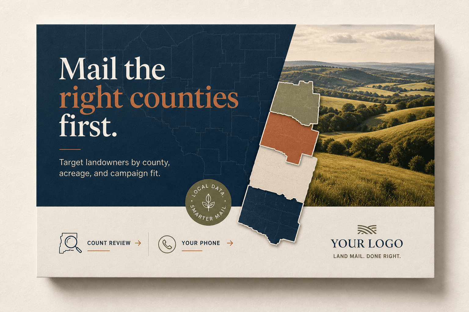
Seller lead framing
County stack quantity logic
Single- and double-sided variations
Short headline, direct CTA, and a stronger visual hierarchy so the card still reads in one glance.
Built for investors who need one campaign spread across several counties without losing the billing trail.
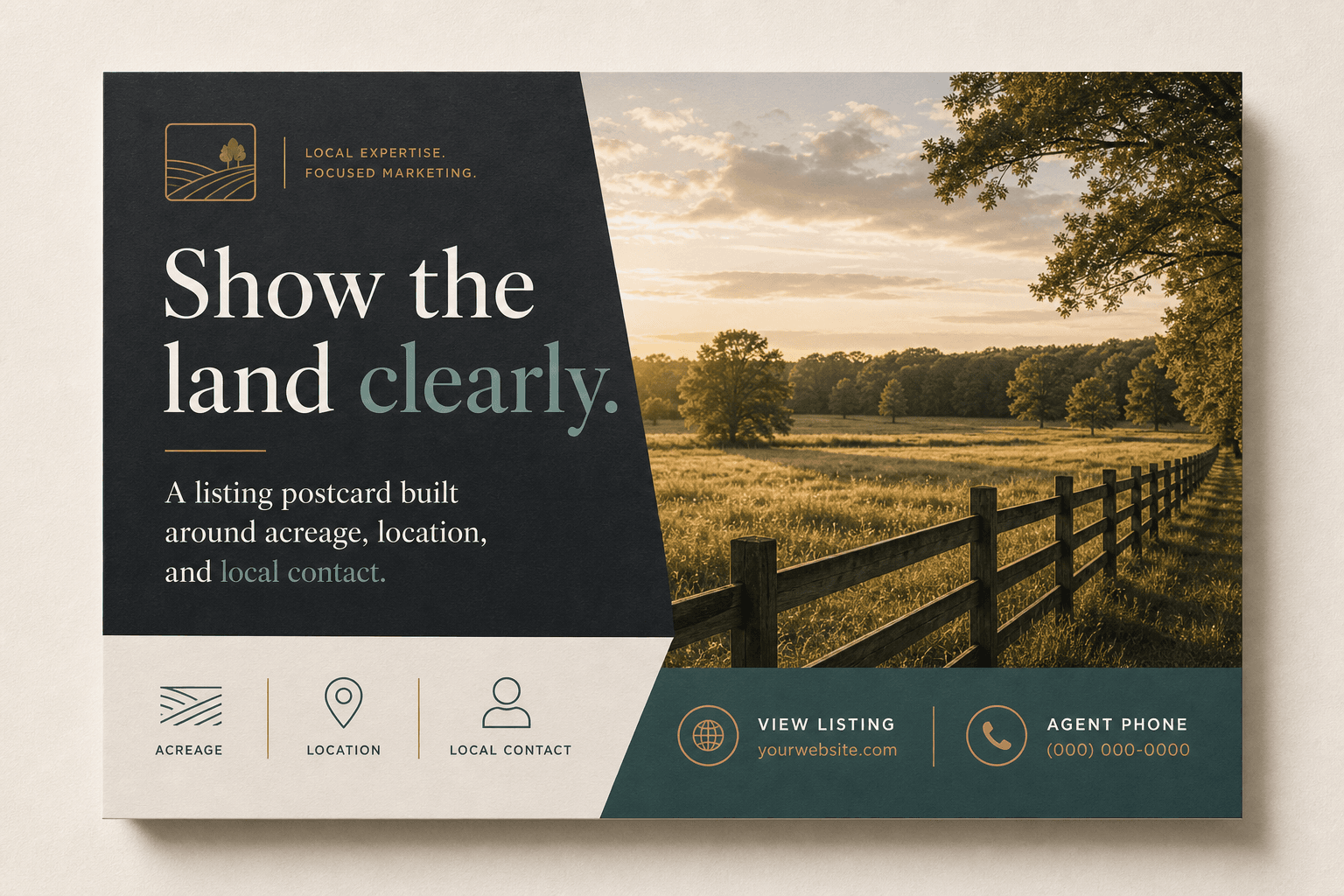
A cleaner listing-forward card for agents who want local land credibility without cluttering the message.
Lead with the offer or the listing. One main message wins over trying to explain every edge case on the front of the card.
Use the reverse side for parcel criteria, owner reassurance, process notes, or a property-specific supporting story.
Logos, phone numbers, website links, rough inspiration, and county or targeting details are enough to start a clean first draft.
One primary message, one call to action, and one contact path. No clutter and no generic mortgage language.
Optional space for additional proof, county list, land-buying criteria, or a listing support message.
Your logo, phone number, website, and any reference cards you want us to loosely follow.
Next step
The order flow keeps county selection, quantities, postcard copy, and local review in one place.